Showcasing creative media through a brand that embodies the student experience at university.
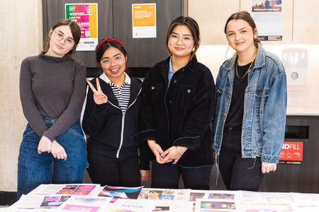
Spectra was a colossal project undertaken by myself and my classmates. Our team of 26 students and two lecturers created a creative media showcase from the ground up. For this project, I was a part of the Branding Team. The creative media discipline we handled was Strategic Communications.

Photo credit: Declan Young
The project
what was the project
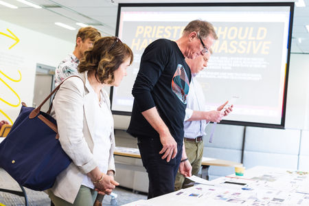
Spectra is the 2021 version of the annual Creative Media Showcase: created, run and hosted by the GRD310 Service Design class. The showcase celebrates the work and achievements of the students from Creative Media, including film, graphic design, strategic communications, photography, creative writing, theatre arts, games art and design, and sound.
The project was extensive and involved many extensions of graphic design skills. Our teams were split into branding, online spaces, promotional campaign, publication, social media, spatial design, and wayfinding. Each team and its members worked collaboratively with others throughout the process. The final showcase is an amalgamation of everyone’s inputs, ideas, and concepts. Guided and heavily aided by Erica and Eko, who essentially acted as project managers, the GRD310 class created and implemented the showcase from scratch.
who was it for
The project had many stakeholders and audiences, including high school students, who were one of the primary target audiences for the showcase. The event is also for students, family, friends, staff, industry, and anyone who would want to attend. It was an open invitation event.
However, the event was really for the class. It was an opportunity for the students to experience a realistic service design project. The showcase provided us with the tools and skills to take into our futures and careers, which ties in nicely with the final concept behind Spectra.

We did a lot of brainstorming in the first couple of weeks
Our class discussions in the first week were pretty surface-level; however, they would spark thoughts and ideas that ultimately influenced the direction of the showcase.
We looked into the past services of the Creative Media Showcase, including Solar, Futurism, and What’s In Store. Collectively, we disucssed what we thought were positives and negatives of these services, what could be improved on, and what our main experiences with the events were.
We also extended this thought process to outside events that we’d attended. Early on, it became evident that the events we remembered and liked created immersive experiences and atmospheres. This common thread among individuals and separate group discussions heavily influenced the showcase’s theme.
With these discussions in mind, we then thought about the team and individual skills and weaknesses.
I thought about the skills and weaknesses relevant to service design and team management, including things that aren’t necessarily skills (more attributes, possessions, etc.).

Photo credit: Fioline Oetomo
The branding and the concept
The branding team
I was lucky enough to be selected for the branding team! I worked alongside Steph Pacia, Yuyuan Duan, and Gia Huxley.
The concept
As soon as we were separated into our teams, we began brainstorming concepts and themes. It felt like everyone was on the same page about the concept from the very beginning. The main discussion occurred in week four, and the idea was primarily settled by week six. A name followed in week seven and premiered in week 8.
Coming out of COVID, we were all looking for something bright, immersive and fun. Inspired by Dani’s Pink Floyd shirt, we started playing with the idea of how we can represent individual journeys and paths with light, refractions, and colour. These journeys are our paths through university and into life.
The idea of us entering uni as one beam, getting refracted around, bent, and reformed and exiting as a spectrum of identities built from our previous selves was the stand-out concept of this ideation.
Some individuals expressed similar messages through different concepts, such as crystals; however, the group quickly vetoed those ideas. They seemed to lean toward some of the popular trends emerging from social media platforms like TikTok that relied heavily on concepts of spirit and had some religious references.
The name
In week seven, the main competitors for the name were Illuminate and Spectrum.
Illuminate (lumen, laminate) didn’t entirely fit with the idea of our concept. Illuminate conveyed the idea that we were shining a light on the students at Murdoch. Though it’s true, it doesn’t capture the story of going into university as a single beam, being reshaped/refracted and exiting as a kaleidoscope of colour that is representative of our growth as individuals and within our discipline.
Spectrum (spectra) could be misinterpreted as a nod to the pride branding or the colloquial meaning of ‘being on the spectrum.’ After discussing our concerns, we all agreed that it wasn’t necessarily bad, even if the concept was misinterpreted. On the branding team, our concerns were mainly that an identity involving rainbows would be too similar to pride branding, and we could be viewed as copying them. However, this was a passing concern as we decided to have a colourful palette early on, but not a rainbow palette. This was due to the number of disciplines we had to represent.
Another concern of the branding team was that both names had quite a few characters. We preferred something shorter and punchy.
Finally, we settled on the name Spectra; a variant of the word spectrum.


